

We’ve a guest blogger this week: accomplished digital designer Sailesh Vaghela walks us though the creation of his breathtaking winning entry to our Draw Chris Hadfield competition.
Hi my name is Sailesh, I created the winning entry for the Chris Hadfield competition set up by the fine people at Applydea. The competition was to create a piece of art using the Maglus stylus, and to have Chris Hadfield as the main focus.
This blog post will explain some of the processes in how I created my winning piece, all done with the awesome Maglus stylus.
I started with a very vague idea of what I wanted, thinking about what people associate with Chris Hadfield, which was space, Canada and of course David Bowie. As an idea was formulating I got to searching for images, Google has a plethora.
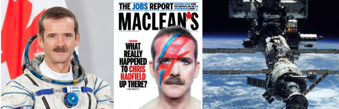
I found the above photos were useful for the idea that had eventually been fully formed from some time wandering various images and thoughts. As time was an issue at this point, I took these three photos into Photoshop and quickly came up with the following composition.
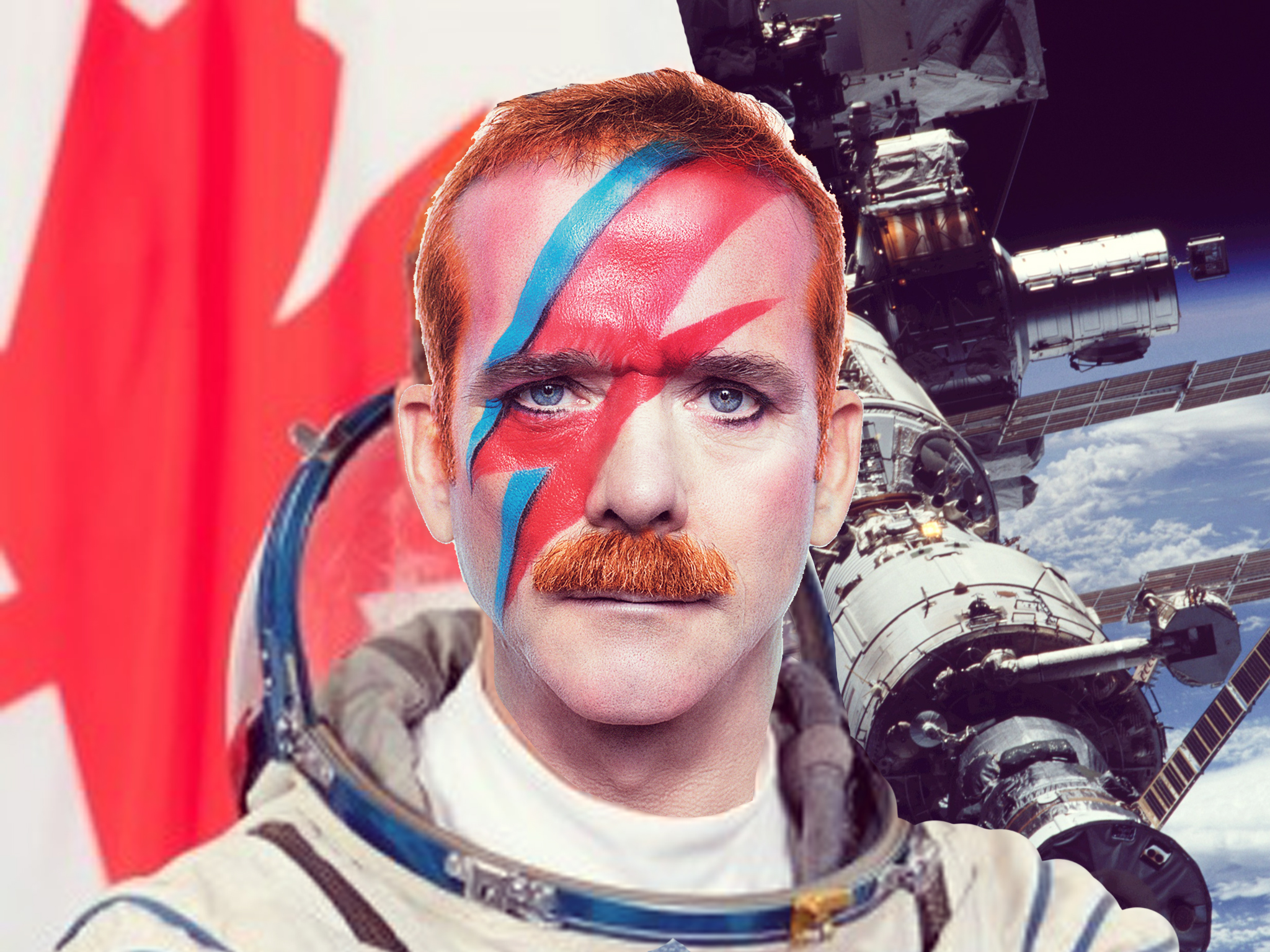
Having a photo reference to rely upon is great as it helps reassure yourself with what you are
aiming to create – sometimes your goal can get lost in those intense doodling times.
Having a photo reference is definitely something a strongly recommend, and makes the process as a whole a bit more efficient.
Finally! We’ve done the prep work to start actually doodling. Just to mention the app I used for this piece, it’s Paper by FiftyThree. It’s a drawing app specifically created for iPad, and has a rather big following on social sites like Tumblr. My reasons for using it is because I’m the most familiar with it and its pretty elegant. It has some restrictions; you can’t have multiple layers nor import photos, but through this you push your artistic ability just that further so it’s all good.
Anyways enough plugging my fave app, lets get back to the creation process with my trusty Maglus stylus! I’ve decided to split the process into steps, so it’s easier to digest, but I advise to read through and use the steps as guidelines rather than strict stages. Oh, and enjoy yourself!
1. Start with line
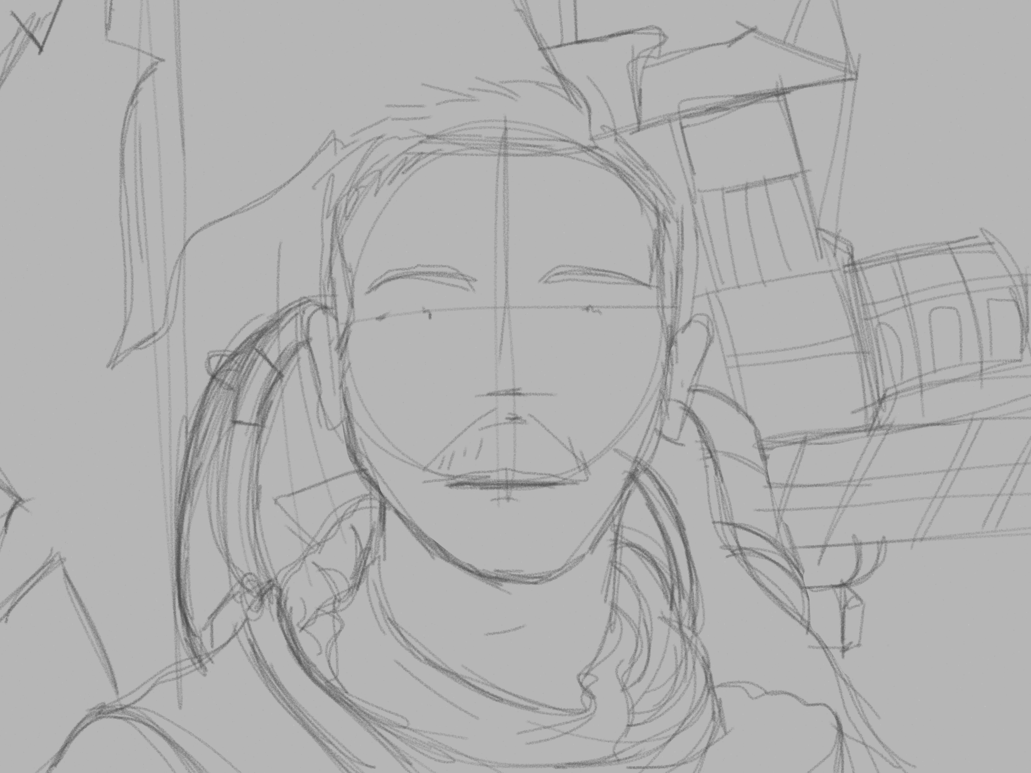
I find that best place to start is with the line, using the colouring pencil tool I selected a dark grey. On the canvas itself I applied a light grey, just so when the time comes to add colour the highlights will pop with ease.
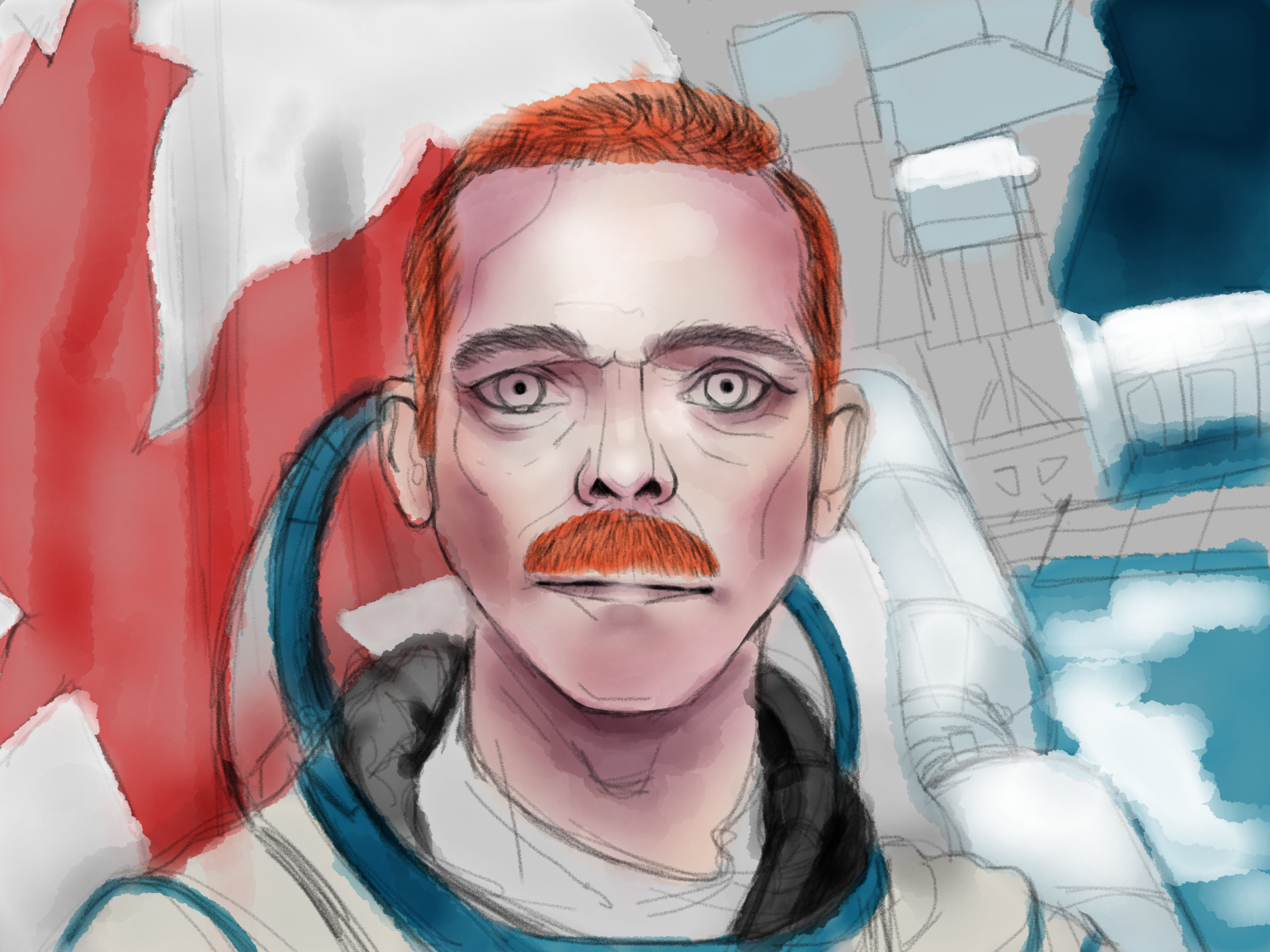
Doing the line first helps with planning a piece and ensuring things are in the correct place. This is especially important if you’re drawing someone that is known, in this case Chris Hadfield. So whilst drawing the line I’d be constantly looking up at the photo reference to ensure things looked right in the face-region.
Initial step in regard to line is to get a feel for the canvas and placing general, loose. and hairy lines down. It helped that my photo reference was the same size as my iPad screen, but again it is a photo reference and you can use it as that to varying degrees.
I figured the priorities for this piece were to ensure the face looked correct, but the rest could be a lot more looser – this was partly due to time constraints but it also made a lot of sense so I went with it!
2. Refine and rework line
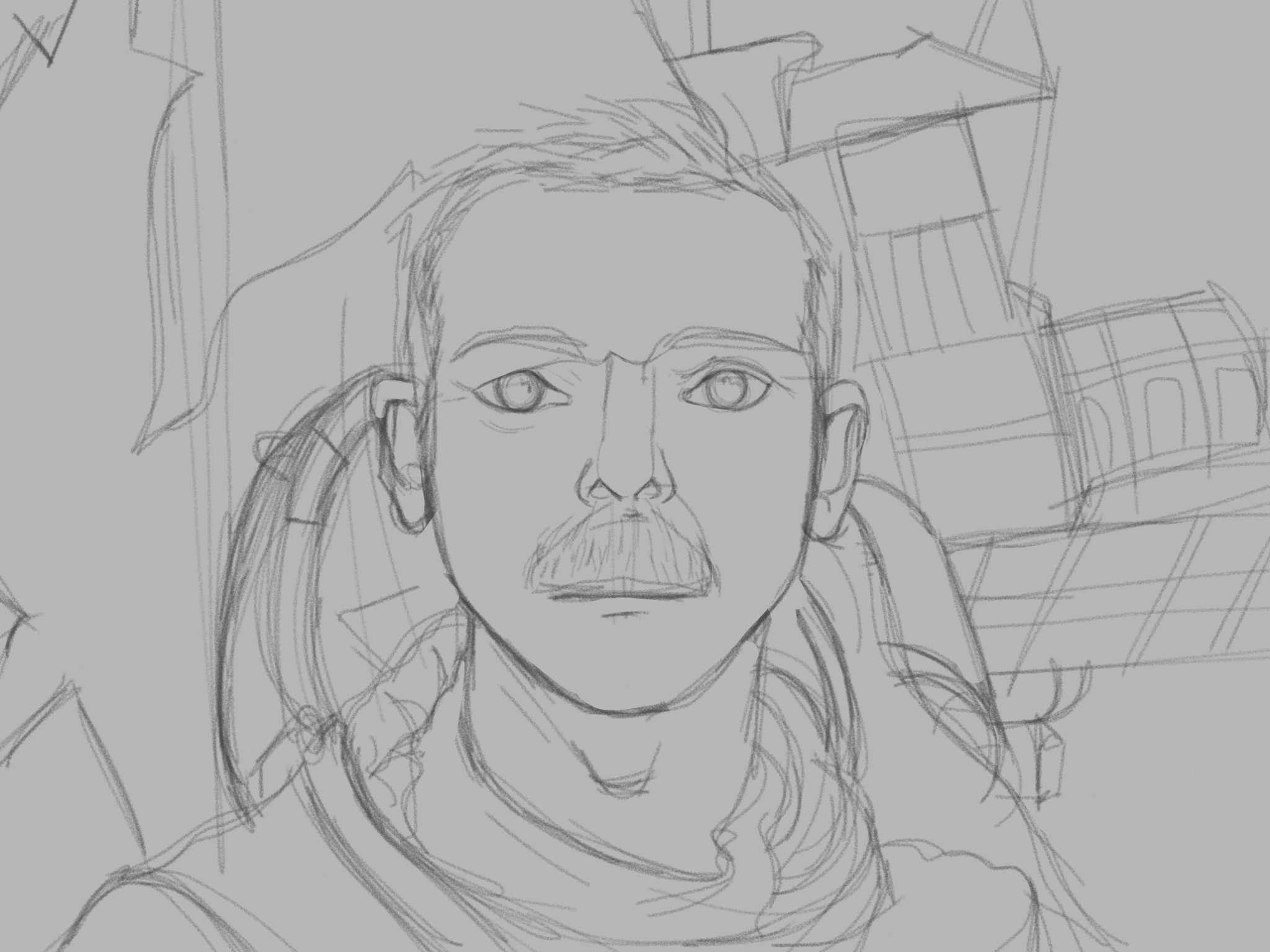
Once you’ve got the general loose lines on, and everything is in the rightish place, it’s time to go back over everything and refine. I find it helps to duplicate the canvas at this stage, just incase you do anything overly risky and ruin it you have a fallback option. In fact duplicate when you feel you’ve reached a point in your piece, it’ll work out great if you want to create something cool like an animated process GIF!
Focusing on sections of the image at a time, start to go over with a slightly darker colour again with the colouring pencil tool to define the line. If it gets too messy then you can always erase the original line and do it again – remember you’ve done it before and you can do it again, so don’t be afraid to erase your ‘precious’ lines, it’ll most definitely work out better in the long run.
This stage of the process does take a while, but don’t worry, I think the longer you take the better the final piece will be. It’s like building a house, the better the foundation – the line – the more solid the building – the end result!
So that completes the line portion of the process, my line took roughly two and a half hours, which from experience is pretty fast! Onto colour…
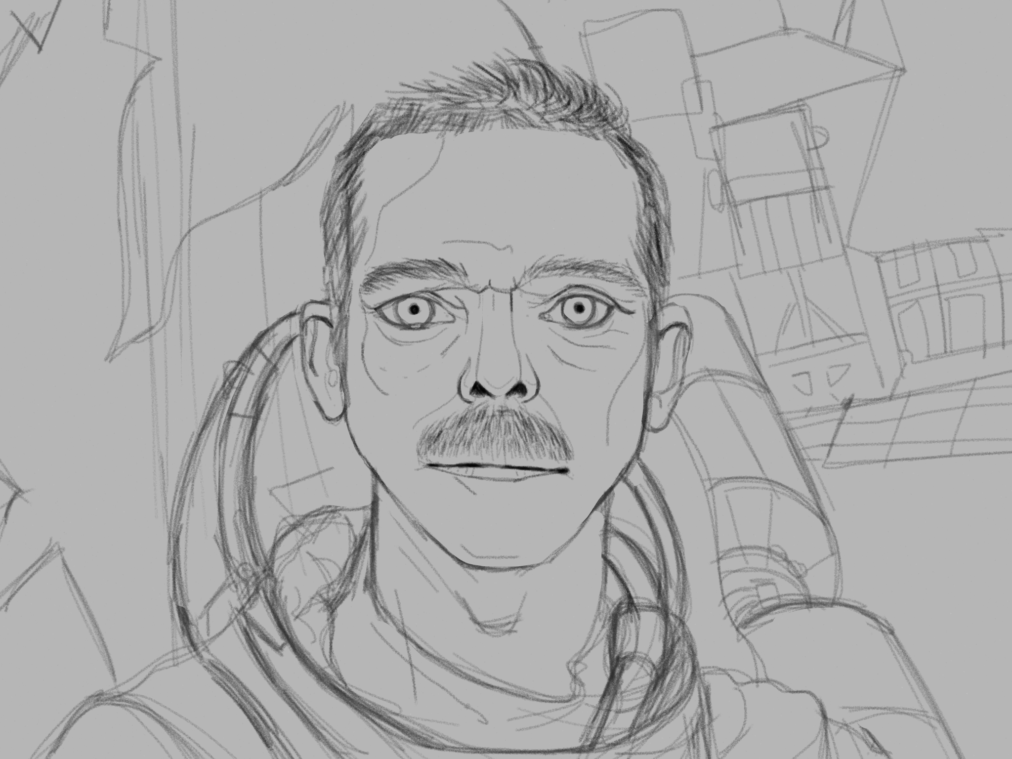
3. Building up colour
This is pretty daunting, look at all those line – it looks so flat! So, we need to make this image not flat with the use of shade in the way of colour. Start with the watercolour brush tool, and within five minutes your piece will start to take shape. Promise.
It’s all about looking at your photo reference, realising what colour is needed for a certain section and mixing a lighter version of it. The idea is to build-up to the desired colour rather than plopping on something bold, as you’ll be wasting time trying to make it work otherwise. This method will give you better control and a better feel for your work.
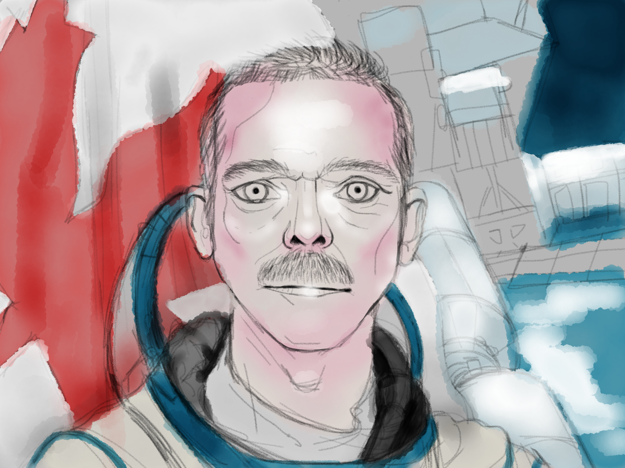
For example, looking at the flag in the background, I initially used a single shade of red and coated the whole maple leaf in that colour, and then to add depth I would go over sections again with the same colour to push sections back. The watercolour brush tool gives a ‘Multiply’ effect when going over something again. And if I find a certain section has gone a tad too dark I would use white to wash over it and then to reign it in again with a more suitable colour or shade.
Once you’re happy with the shading, the next step would be adding highlights, so with a white I
would look at the photo reference and see how the light affects the face and/or objects, similar to how you would see how shade would fall onto objects in the photo reference. Again it’s a case of being careful and building up to a result rather than plopping huge bold highlights onto the canvas.
I find with the Paper app, it’s good to be light and quick. This process can take a while before it starts looking like it’s going in the right direction, but it’s worth persevering in any case. You can also revert to the previous duplicate and learn on the way!
4. Detail and finish!
Once you’ve placed most of the general colour and got your shading and highlights in order, it’s
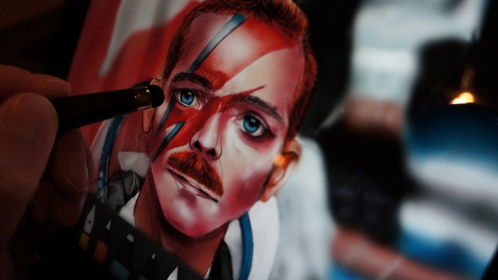
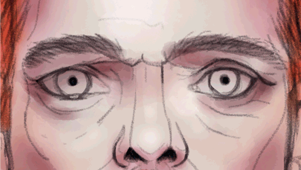
time to take another pass and to add detail. I usually go about this by picking a colour, in the area that needs detail and refinement, and then altering the tone slight – lighter or darker dependant on effect you want to achieve. For example take the skin about the eyes, to give character I added some of the wrinkles from the photo reference. Be sure to back away from the loupe now and again when adding detail, to ensure the effect doesn’t look odd overall. The GIF below illustrates the process of adding detail.
When I was happy with the amount of detail on the face, I was actually running out of time, I
figured I could insinuate detail on the flag and space station instead of going overly detailed about things, more so on the space station as that was extremely detailed. I activated the Blend function in the Paper app and smudged appropriately. Once I had smudged the background I brought back some details by using the colouring pencil tool and lightly touched in some shapes again – but not too much as I wanted to ensure the space station remained, visually, in the background.
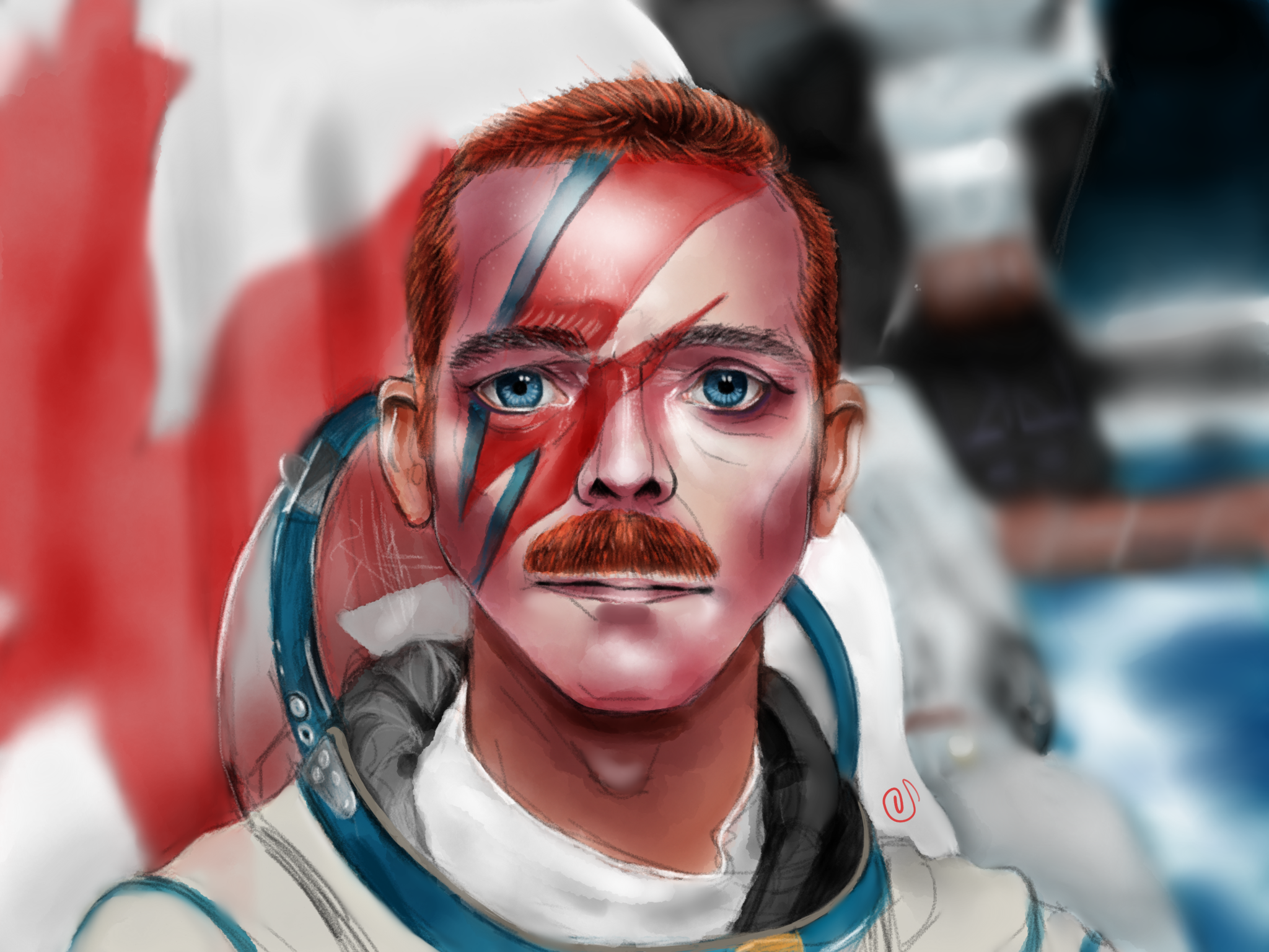
Looking back my quick fix or blurring the background worked as it gave a sense of depth and focus to the image. And that is it, the image was complete and I submitted it. Really pleased I won the competition as I really enjoyed the process. In total, the time came to roughly five and a half hours. The Maglus stylus was definitely a key player in this, I love the heft and build of the thing – it’s perfect and I highly recommend anyone wanting to explore art on a tablet.
Thank you for reading this process post and I really hope it helps you in your doodling adventures.
Sailesh
Twitter – twitter.com/saileshvaghela
Tumblr – saileshcreates.tumblr.com
Website – sailesh-online.com
Facebook – facebook.com/saileshcreates
YouTube – youtube.com/saileshonline
Sailesh Vaghela
Digital designer, digital artist, doodler, curator, YouTuber - see more at http://www.sailesh-online.com
 2 COMMENTS
Wow, this paragraph is nice, my younger sister is analyzing such things,so I am going to
let know her.
Can Hair Regrow
My brother suggested I might like this blog.
He was entirely right. This post actually
made my day. You cann’t imagine just how much time I had spent for this information! Thanks!